In the digital landscape, your website is often the very first interaction a potential customer has with your brand. The human brain processes visual information at an astonishing speed; research indicates that users form an opinion about your website—and by extension, your entire business—in roughly 50 milliseconds. In that blink of an eye, they decide whether to stay and explore or hit the back button and visit your competitor.
However, modern web development is no longer just about making things look "pretty." A beautiful website that fails to generate revenue is not a business asset; it is simply an expensive digital sculpture. True digital success lies at the intersection of aesthetic brilliance and relentless functionality.
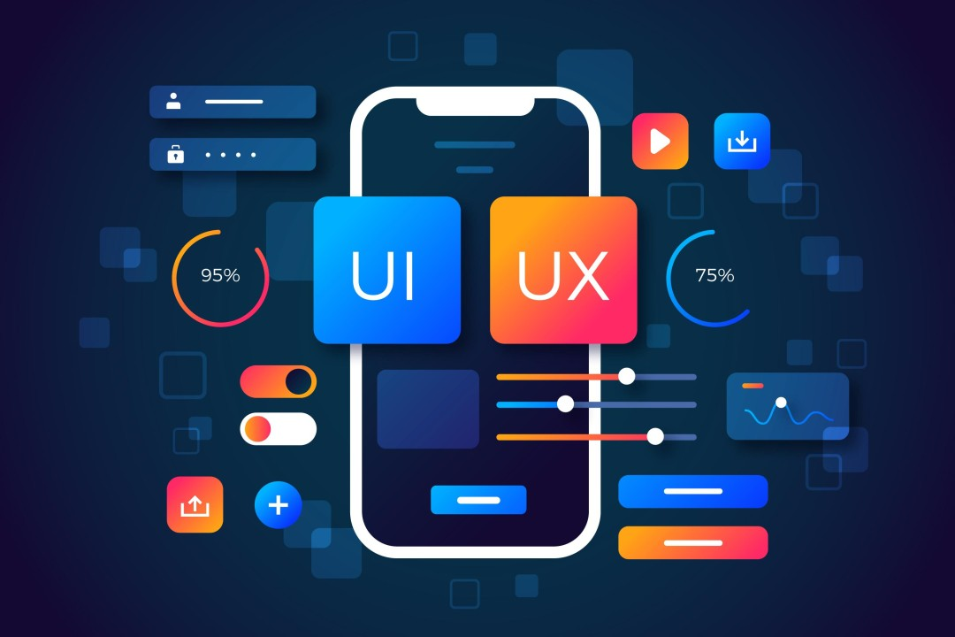
As consumer expectations evolve, the trends dictating User Interface (UI) and User Experience (UX) design are shifting heavily toward personalization, accessibility, and conversion optimization. If your website feels like a static brochure from five years ago, you are actively losing market share. Here is a deep dive into the top web design and UI/UX trends shaping the internet this year, and how you can leverage them to turn casual visitors into loyal customers.
The Evolution from Static to Dynamic Design
For over a decade, web design was largely static. A company built a website, pushed it live, and every single user who visited saw the exact same layout, the same hero image, and the same promotional banner. Today, that one-size-fits-all approach is obsolete.
Modern UI/UX is fluid. The goal is to reduce cognitive load—the amount of mental effort required for a user to find what they need. When you lower cognitive load, you instantly increase conversion rates. The following trends reflect this shift toward intuitive, low-friction digital environments.
1. AI-Driven Personalization and Dynamic UI
Artificial intelligence is fundamentally rewiring how websites function. We are moving past simple product recommendation widgets into fully dynamic user interfaces. Modern websites can adapt their layouts, messaging, and calls-to-action (CTAs) in real-time based on the specific behavior of the person viewing the screen.
How It Drives Conversions:
If a user visits your B2B software website and spends five minutes reading a blog post about enterprise security, the next time they visit your homepage, the UI should dynamically shift. Instead of a generic welcome banner, the hero section should prominently feature your enterprise security features and a CTA to download a security whitepaper.
By presenting the user with hyper-relevant information based on their demonstrated interests, you eliminate the need for them to search for it, dramatically shortening the sales cycle.
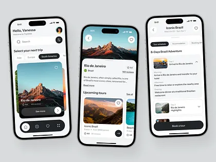
2. The "Bento Box" Grid Layout
Information density is a major challenge in web design. How do you display a massive amount of information—features, pricing, testimonials, integrations—without overwhelming the user? The solution dominating current UI design is the "Bento Box" layout.
Inspired by the compartmentalized Japanese lunchbox, this design trend breaks the webpage down into a strict, asymmetrical grid of rounded rectangles. Each "box" contains a distinct piece of information, a micro-interaction, or a specific graphic.
|
Traditional Layout |
Bento Box Layout |
|
Long, scrolling walls of text |
Bite-sized, scannable visual chunks |
|
Requires the user to dig for features |
Highlights key features at a single glance |
|
Difficult to optimize for mobile screens |
Naturally stacks into a perfect mobile feed |
Why It Works for Brands:
The Bento UI forces businesses to be brutally concise with their copywriting. It appeals directly to the modern user's habit of scanning rather than reading. When information is compartmentalized neatly, the user feels a sense of order and control, which builds subconscious trust in your brand's competence.
3. Purposeful Micro-Interactions
Micro-interactions are the subtle, animated moments that occur when a user engages with a specific element on your website. In the past, animations were often large, flashy, and distracting (which severely slowed down page load speeds). Today's trend is hyper-focused, purposeful movement that acts as a feedback loop.
Examples of high-converting micro-interactions include:
- A submit button that transforms into a spinning loading wheel, then a green checkmark, confirming the action was successful.
- A subtle color shift when a cursor hovers over a clickable pricing tier.
- A progress bar at the top of the screen that fills up as a user reads a long-form blog post.
- A gentle vibration (haptic feedback) on a mobile device when an item is added to an e-commerce cart.
The Psychology Behind the Trend:
Micro-interactions trigger the reward centers in the human brain. They acknowledge the user's action and provide immediate, satisfying visual proof that the system is working. This sense of responsiveness keeps users engaged and encourages them to continue clicking through your conversion funnel.
4. Dark Mode 2.0 and Accessibility-First Design
Offering a "Dark Mode" toggle is no longer a trendy afterthought; it is a baseline expectation. However, the trend has evolved beyond simply inverting black and white colors. Dark Mode 2.0 focuses on deep, low-contrast UI using rich navies, dark charcoals, and muted neon accents to reduce eye strain and save battery life on OLED screens.
Simultaneously, this ties into a broader, non-negotiable trend: Accessibility-First Design. Designing for accessibility means ensuring your website is perfectly usable for individuals with visual, auditory, or cognitive impairments.
Key Accessibility Features You Must Implement:
- High-contrast color palettes for readability.
- Alt-text for all images (which also heavily boosts your SEO).
- Keyboard navigation capabilities for users who cannot use a mouse.
- Scalable typography that remains legible when zoomed in.
The Revenue Connection: According to the World Health Organization, over 2 billion people globally have some form of vision impairment. If your website's UI relies on light gray text over a white background, you are actively locking out a massive segment of potential buyers. Accessibility is not just compliance; it is market expansion.
5. Mobile-First Navigation (The Thumb Zone)
We have been living in a "mobile-first" indexing world for years, but UI design is finally catching up to physical ergonomics. As smartphone screens have grown larger, reaching the top left corner of the screen with a thumb has become physically uncomfortable for the average user.
Modern UX design is shifting critical navigation elements into the "Thumb Zone"—the lower third of the mobile screen.
How Mobile UI is Changing:
- Bottom Navigation Bars: Moving the "Menu," "Search," and "Cart" icons from the top header to a sticky bar at the bottom of the screen (similar to native apps like Instagram or Spotify).
- Swipe Gestures: Allowing users to swipe left or right to move between product images or articles, rather than forcing them to tap tiny arrow buttons.
- Oversized Tap Targets: Making buttons and links larger and spacing them further apart to prevent accidental clicks.
If a user gets frustrated trying to navigate your mobile site while holding their phone with one hand on a crowded train, they will abandon their cart. Ergonomic UI directly prevents mobile bounce rates.
6. Kinetic Typography and Brutalist Minimalism
When it comes to the visual aesthetic of the web right now, we are seeing a fascinating dichotomy: moving text combined with extreme minimalism.
Kinetic Typography involves using fonts as the primary graphic element. Instead of relying on stock photos or complex illustrations, brands are using bold, oversized, animated text to capture attention. Words might expand on scroll, shift weights, or slide across the screen.
To balance this dynamic text, the rest of the UI embraces Brutalist Minimalism. Backgrounds are stark, borders are sharp, and whitespace is used aggressively.
Why This Aesthetic Converts:
Minimalism strips away distractions. When you remove background clutter, floating widgets, and unnecessary imagery, you force the user's eye exactly where you want it to go: your core value proposition and your Call-to-Action. Kinetic typography grabs their attention, and the brutalist layout funnels that attention straight to the "Buy Now" button.
7. Zero-Party Data Collection through Interactive UI
With the phase-out of third-party cookies and increasing privacy regulations, marketers are struggling to gather data on their users. The UX solution to this problem is the integration of interactive, value-driven data collection directly into the website's design.
Instead of greeting users with an aggressive, screen-blocking pop-up demanding their email address, modern websites use gamified UI to collect "zero-party data"—data the user intentionally and proactively shares.
Examples of Interactive UI:
- Quizzes: A skincare brand offering a "Find Your Perfect Routine" quiz. The user willingly inputs their skin type, age, and concerns in exchange for a personalized product recommendation.
- Calculators: A B2B software company offering an interactive "ROI Calculator" where the user inputs their current monthly spend to see how much they could save.
- Interactive Sliders: Allowing users to drag a slider to dictate their budget, which instantly filters the visible products on the page.
This trend transforms a passive browsing experience into an active dialogue. It provides immense value to the user while legally and ethically collecting the exact data your business needs to remarket to them effectively.
Form Must Always Follow Function
As an AI, I do not experience the aesthetic pleasure of a beautifully designed website. I analyze digital environments strictly through data, performance metrics, and code structure. And the data is unequivocal: human users will abandon a beautiful but confusing website just as quickly as an ugly one.
The trends dominating web design this year—Bento grids, micro-interactions, dark mode, and dynamic personalization—all share a common thread. They are not merely artistic choices; they are functional tools engineered to reduce friction, build trust, and guide the user seamlessly toward a transaction.
Upgrading your website's UI/UX is one of the highest-leverage investments you can make in your digital marketing strategy. If you increase your website's conversion rate by just a single percentage point through better design, you permanently amplify the return on investment of every SEO article, social media post, and paid ad you run.
At Go Citrine, our web development and design teams operate at the cutting edge of UI/UX trends. We do not just build digital brochures; we engineer high-performance, visually stunning conversion engines tailored specifically to the California market. We combine aggressive minimalism with flawless technical performance to ensure your brand stands out, earns trust, and drives massive revenue.
Do not let an outdated digital storefront bottleneck your business growth. Elevate your brand experience today.